Brand Guidelines
Objective:
Ensure consistency and alignment in all brand communications by defining key elements like logos, colours, typography, and photography.
Introducing Our Brand Book
Here, you'll find essential resources for maintaining consistency in our brand's look and feel, including logo usage, color palette, and typeface guidelines. We also offer practical applications and examples to help you apply these elements effectively.
Additionally, access a variety of assets like the Employee Brand Package, digital and printed materials, and Client Resources & Templates. These include customizable IR plans, IPO checklists, and best practices to support your work with clients.
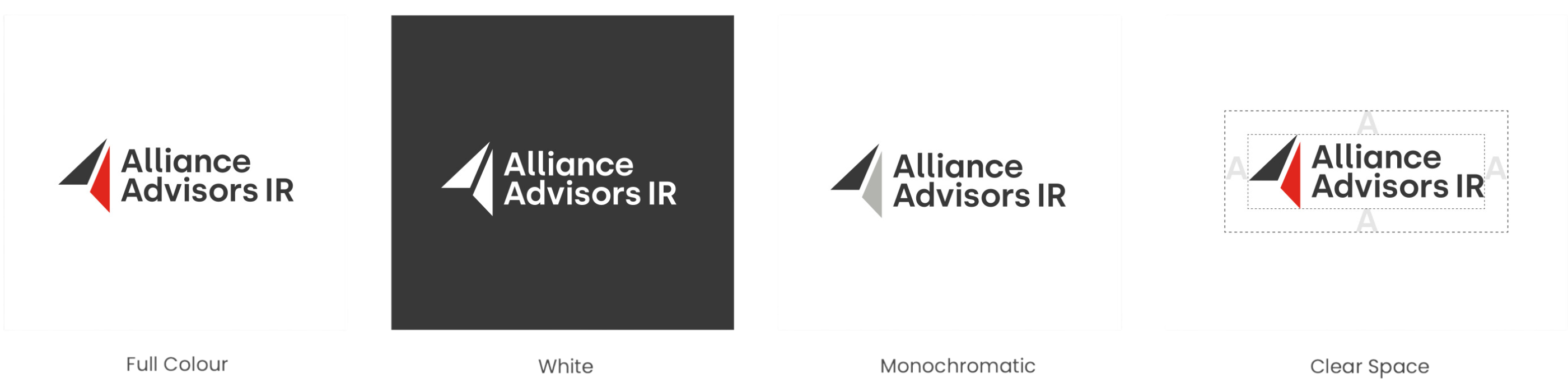
Logo
Download our logo files and learn proper usage guidelines to maintain brand consistency.
Colours
Explore our brand colour palette with examples and tips on correct usage (and what to avoid).
Typeface
Access our typeface details and best practices for applying them in your designs.
Downloadable Assets
Welcome to your AAIR Brand Package!
Inside, you'll find resources to help you stay aligned with our brand: Email signature template, branded Word document, virtual backgrounds for meetings, and LinkedIn banner options. Make the most of these tools to represent AAIR professionally!
Style: Ordinary people (because everyone is a potential investor) in major cities across the world, going about their day. Bold bright colours, with hints of red and yellow, blurred elements in some photos to allude to fast pace.
Sentiment: We are a global company, on the streets of major cities. We are bold and fearless. We don’t hide behind office walls and computer screens - we are out there forming meaningful bonds and connections, speaking to people, organizing creative events and opportunities for companies to grow their audience. We are fast paced, proactive, captivating.
This section contains resources for printed assets, including event banners, postcards, and business cards, designed to maintain brand consistency in physical materials.
This section includes corporate presentation templates and examples of IR plans, along with webinar presentation templates. Use these to create consistent, professional materials for investor and corporate communications.
Let’s get creative with visual elements!
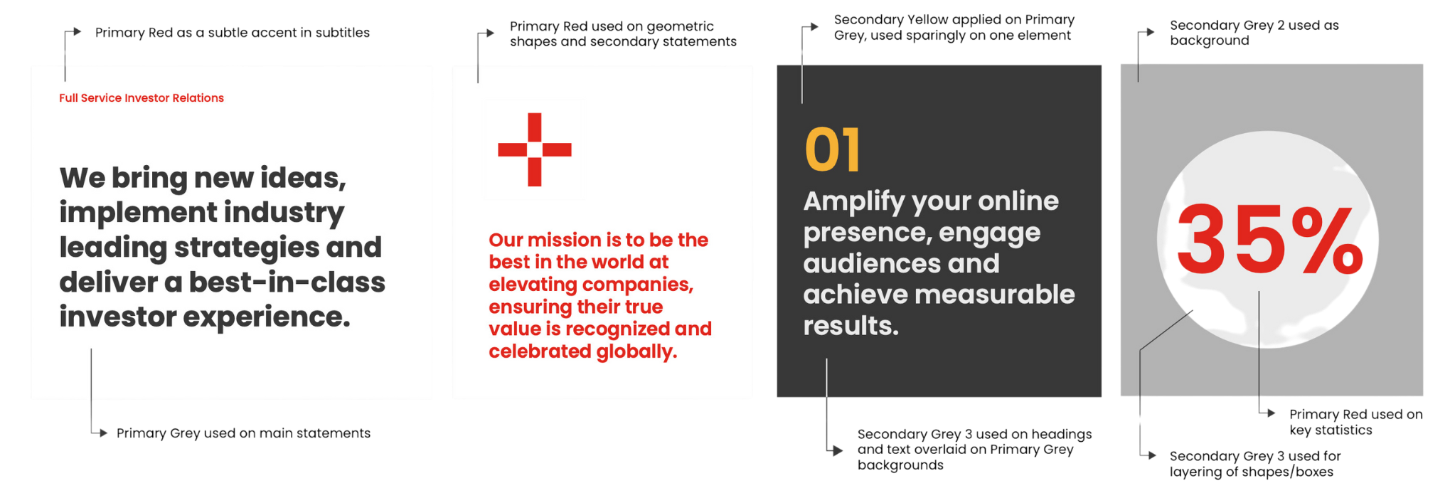
Alliance Advisors’ brand uses geometric shapes instead of traditional icons, reflecting the triangular logo. Use single or combined shapes to align with the accompanying message. This section also includes digital asset backgrounds.
This section provides client resources and templates, including IR plan bases, an IPO checklist, guidelines for handling analyst coverage, best practices for issuers, and insights on corporate access. These tools are designed to support effective investor relations and corporate strategies.
Logo
Colours
Note on colours: The Secondary Yellow colour is to be used in moderation for small accents, applied only on top of the Primary Grey and white backgrounds.
Primary Grey
RGB 57 57 57
CMYK 67 58 55 62
HEX 393939
PANTONE 426
Primary Red
RGB 225 37 27
CMYK 2 95 94 0
HEX e1251b
PANTONE 485
Secondary Yellow
RGB 245 179 53
CMYK 2 34 85 0
HEX f5b335
PANTONE 135
Secondary Grey 1
RGB 121 121 121
CMYK 0 0 0 66
HEX 797978
PANTONE 424
Secondary Grey 2
RGB 178 178 178
CMYK 0 0 0 40
HEX b2b2b1
PANTONE 421
Secondary Grey 3
RGB 235 235 235
CMYK 0 0 0 11
HEX eaeaea
PANTONE 427
Colour Application
Examples
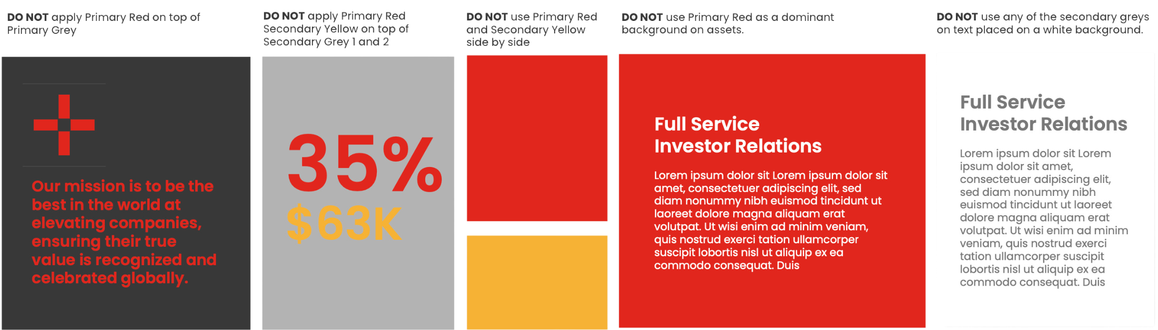
What Not to Do

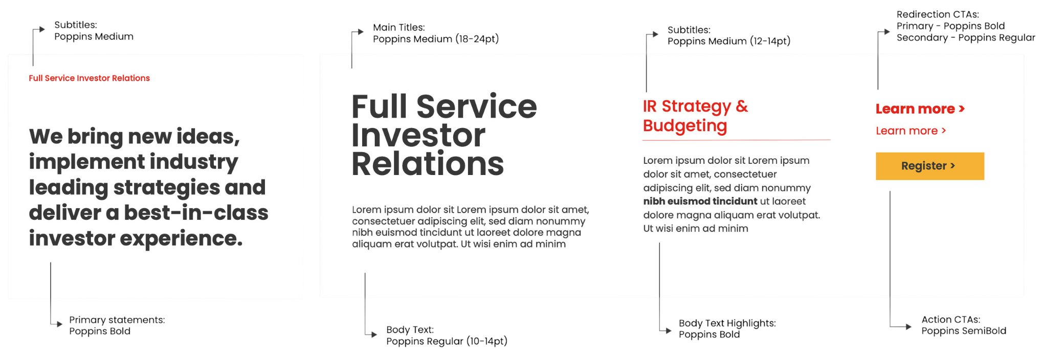
Typeface
Our typeface is an integral part of our brand. Poppins is clear, confident and approachable, and should be used on all communications, both print and digital.
For company emails and email signatures we use Calibri Light as a web safe font.